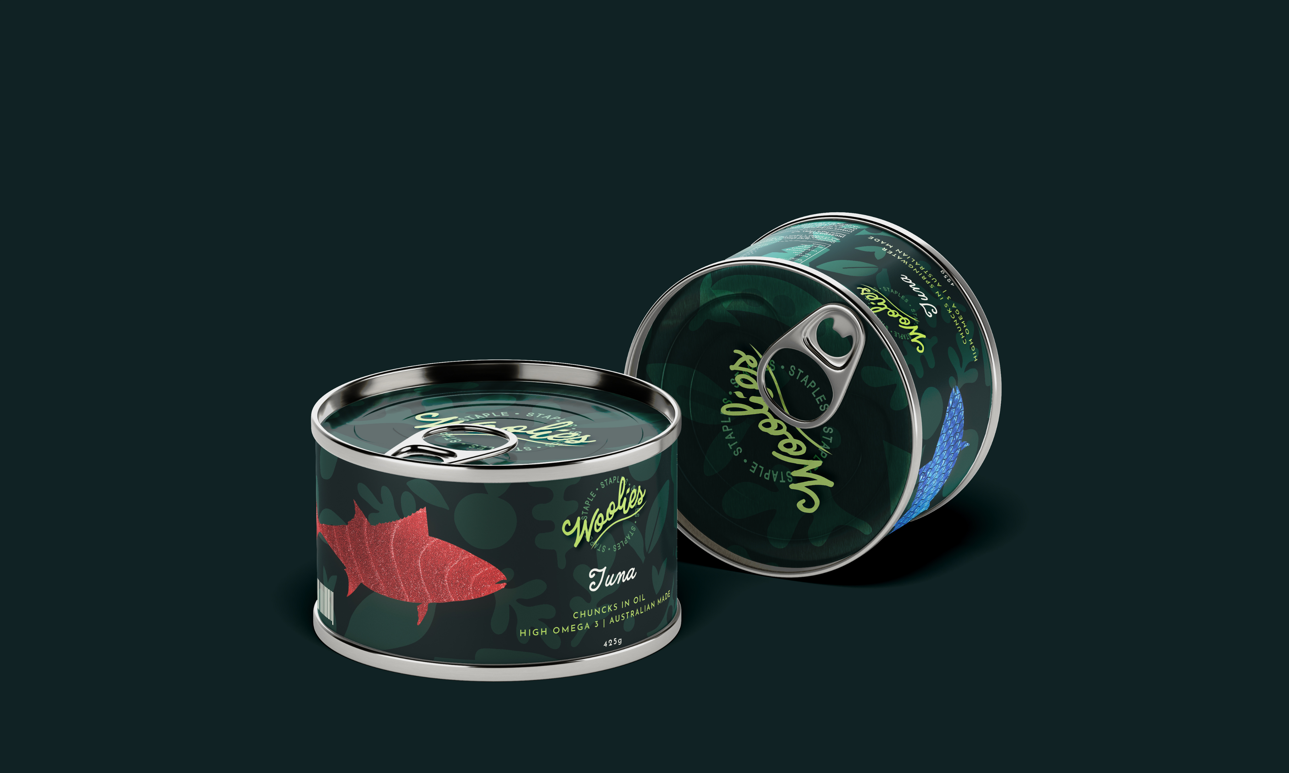
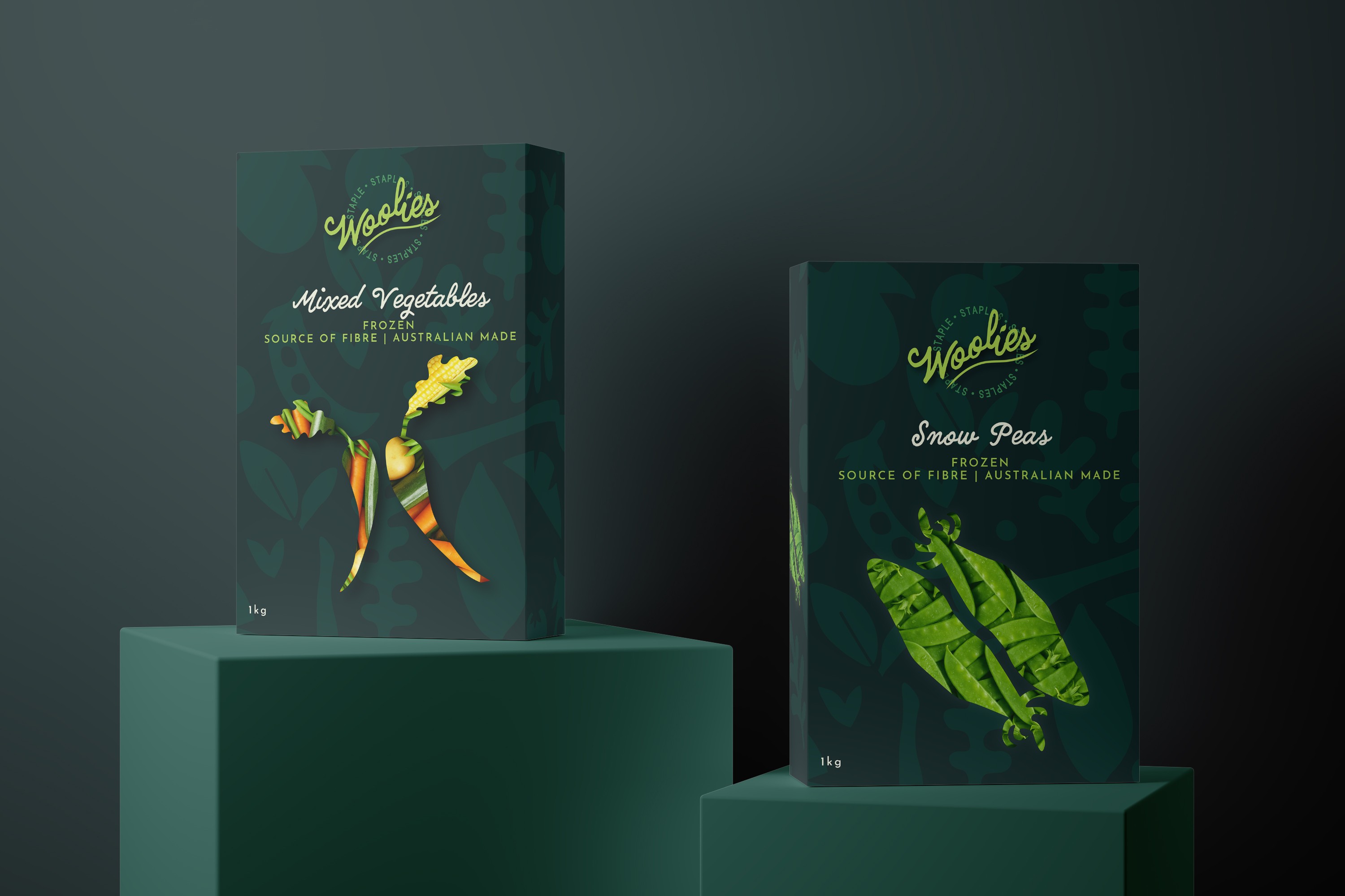
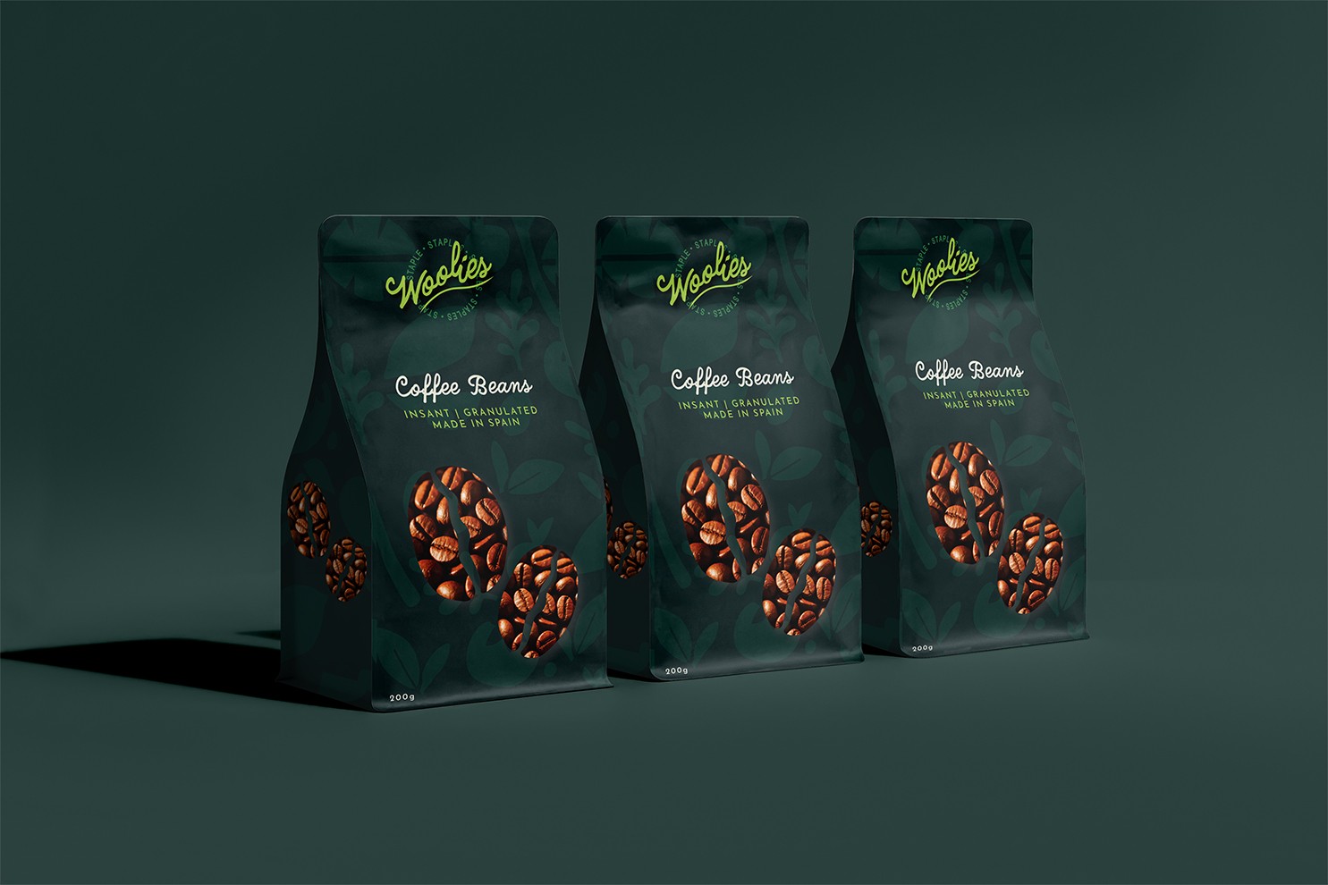
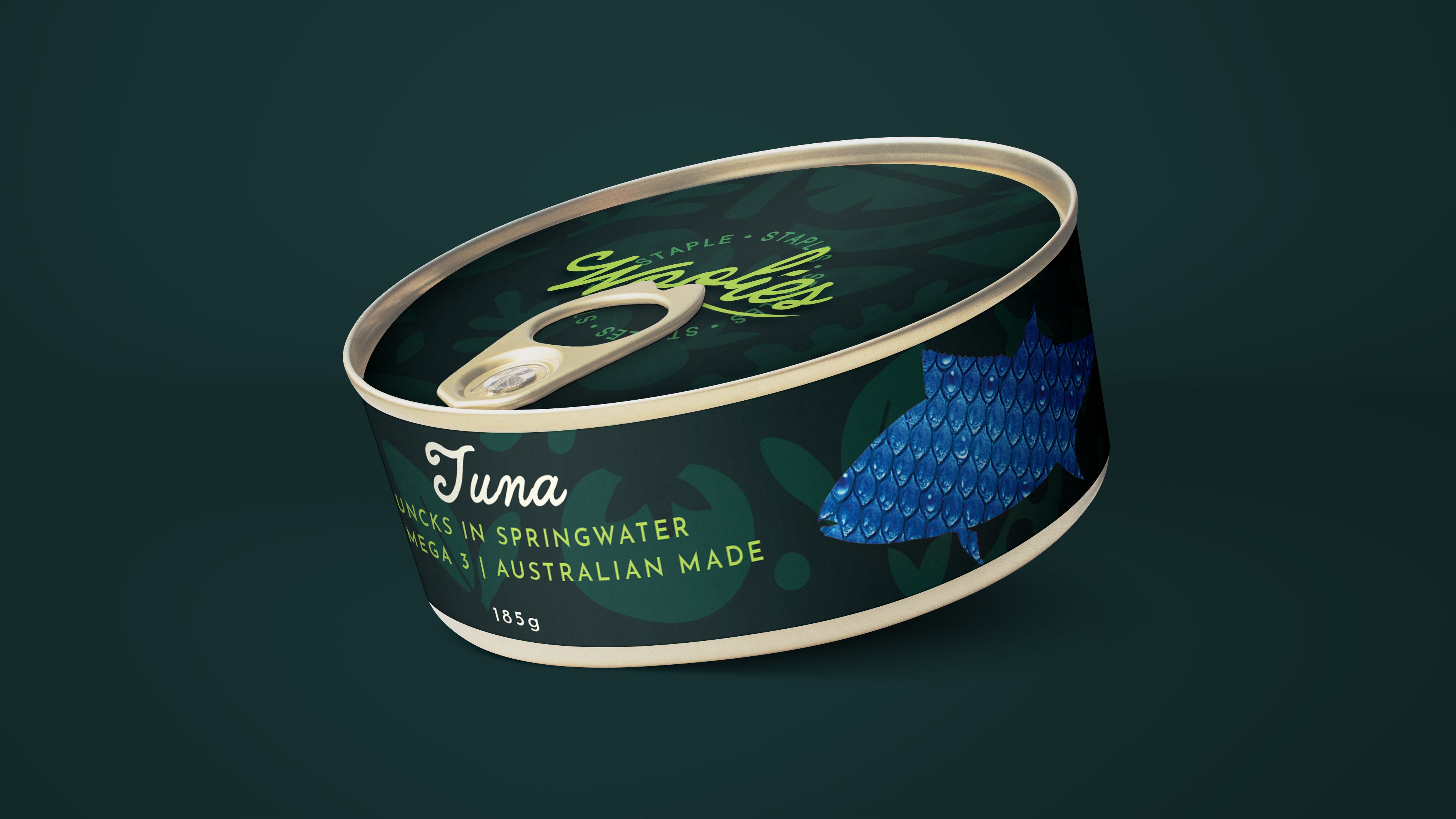
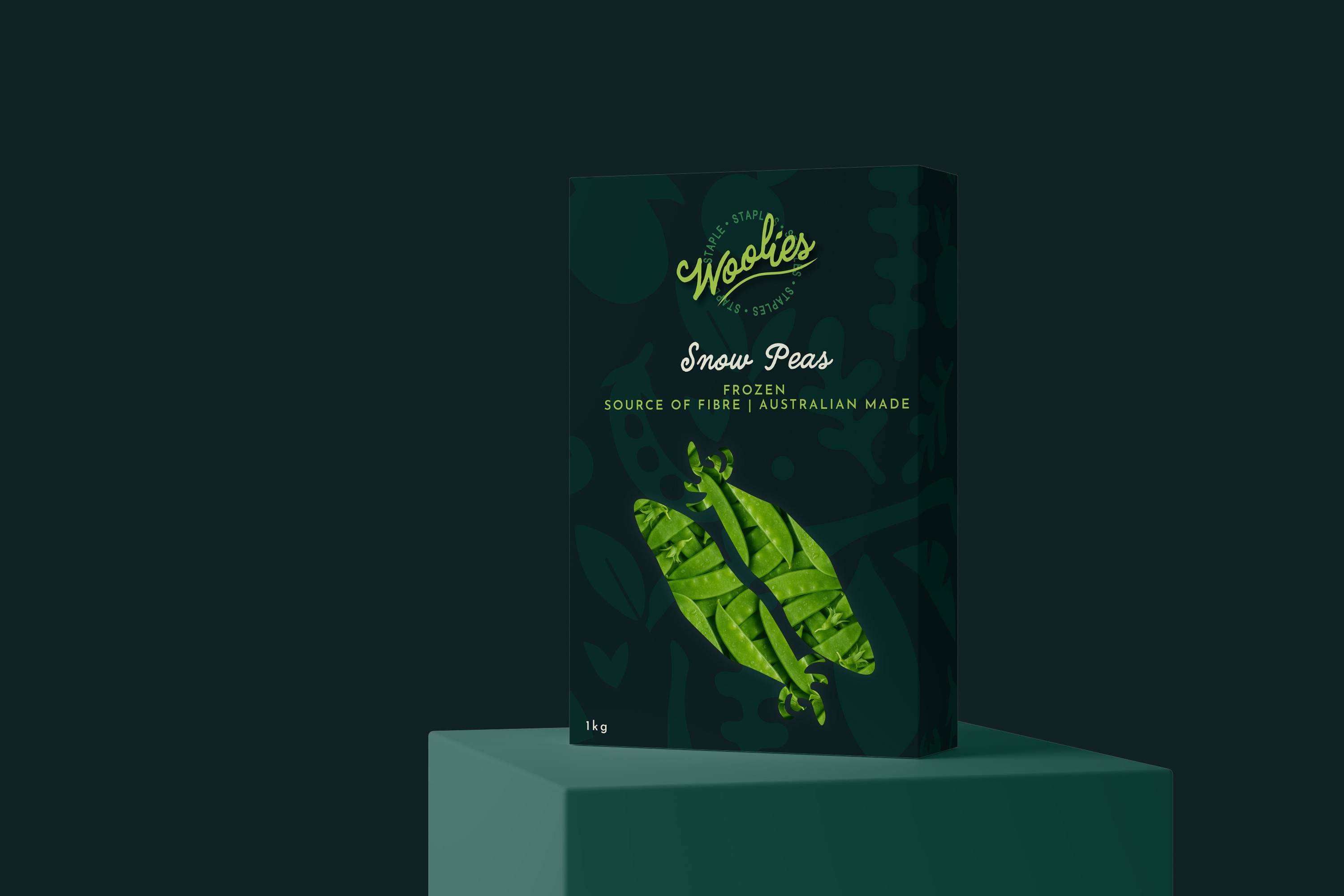
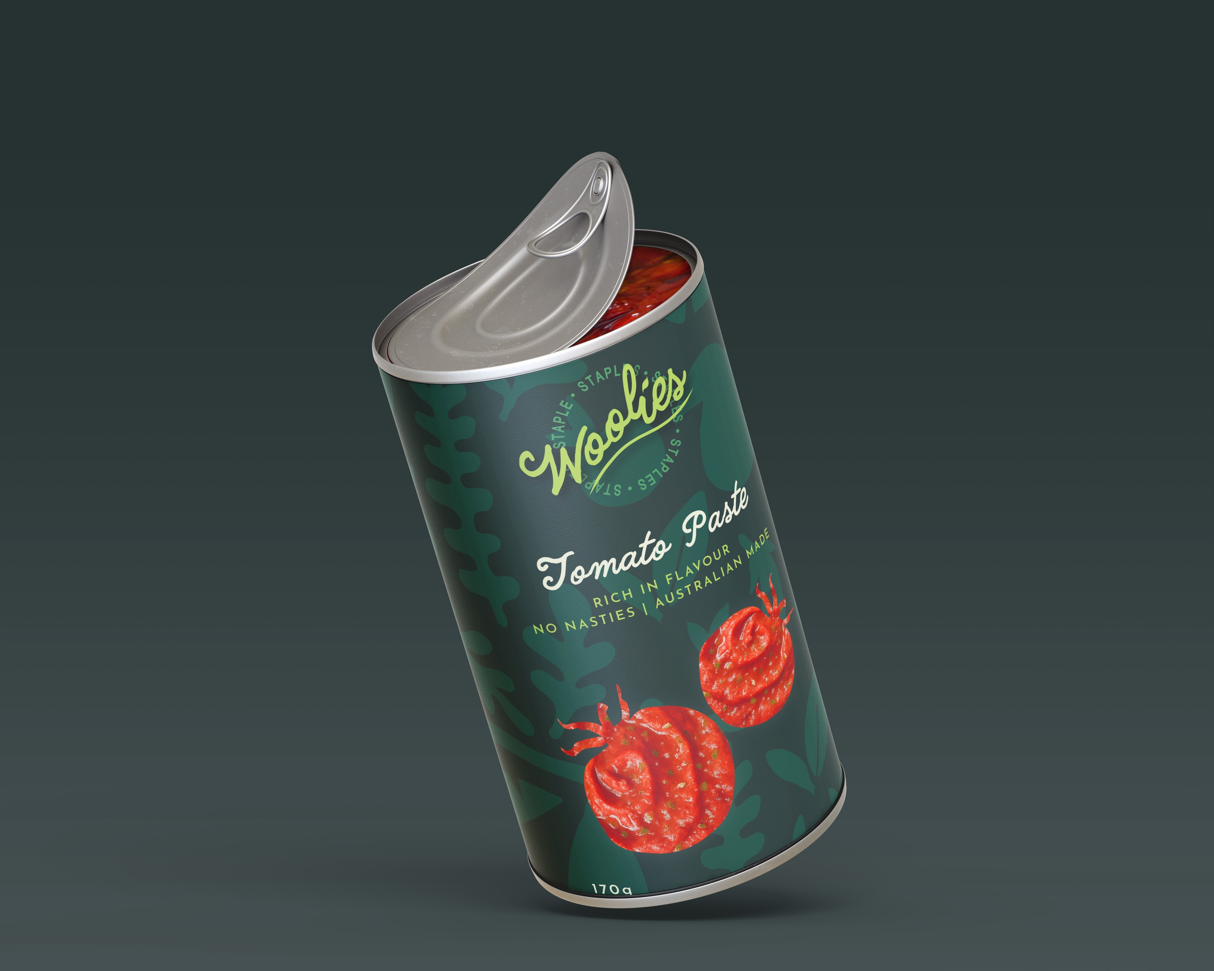
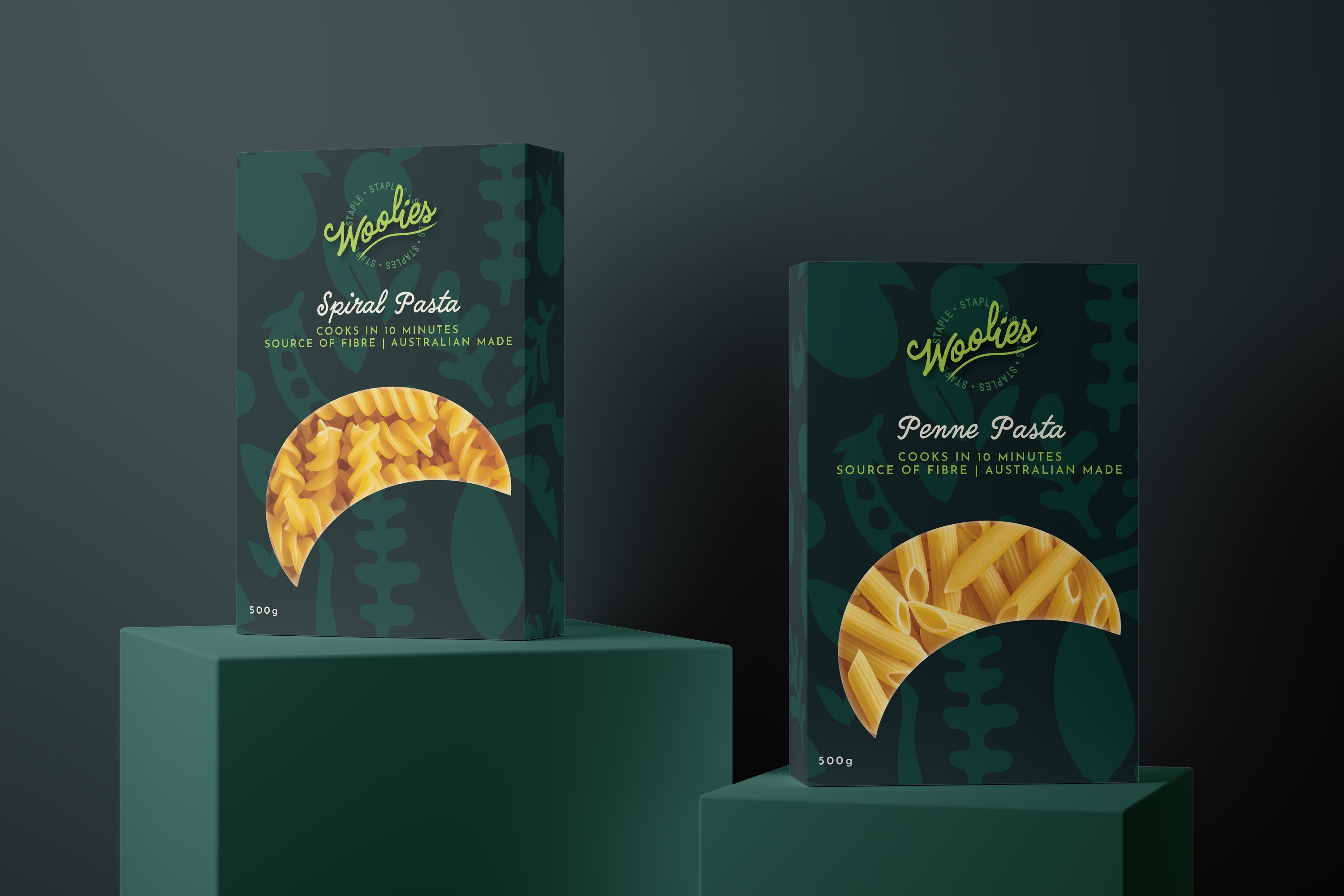
My capstone project reimagines Woolworths’ Essentials as Woolies Staples, a cohesive, proud, everyday range that feels high-quality yet affordable. I rebuilt the brand system (name, logo, colour palette, packaging architecture) to strengthen recognition and shift perception from “cheap” to “smart value.”
The range is paired with a point-of-sale recipe book that demonstrates how quick, inexpensive, at-home meals can be made using these staple items, turning the aisle purchase into practical inspiration.


Considerations
01
Brand consistency: Clear guidelines, prominent logo, and a defined colour system that align with Woolworths’ palette for instant shelf recognition and shopper confidence.
02
Shelf impact: Bold forms, strong hierarchy, and a unified architecture to stand out among competitors and attract new shoppers—echoed in the recipe book to reinforce use and value.