Considerations:
01
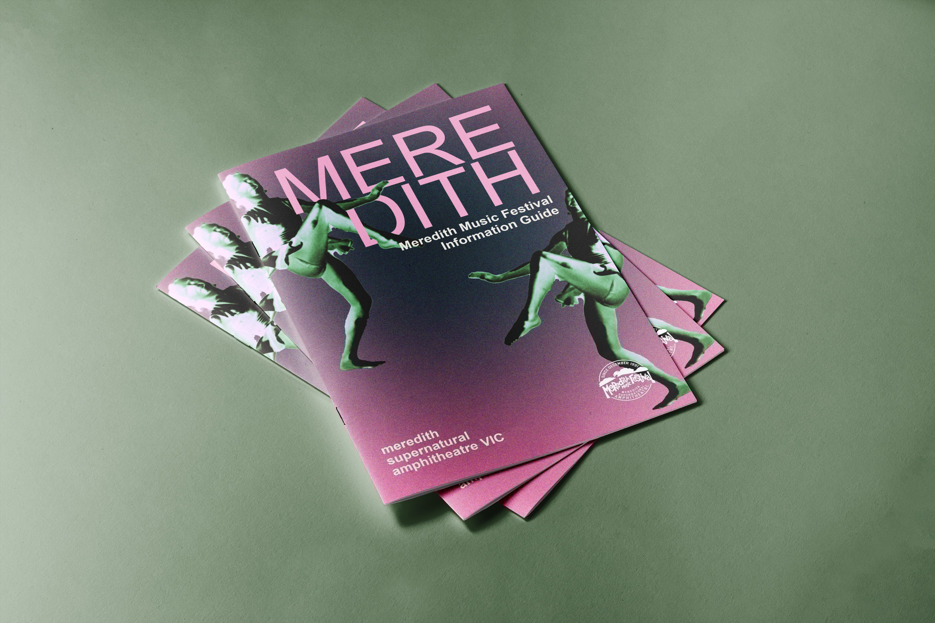
Showcasing the overall aesthetic of the brand was vital. Meredith is known as a grungy, alternative festival, so it was essential to create a fun and engaging guide that would capture the attention of its audience and reflect their unique aesthetic.
02
The use of cohesive materials and pattern-making was essential across both mediums , the booklet and the poster. These designs needed to be closely connected, allowing consumers to clearly see the visual and conceptual link between them.
03
I aimed to develop a new design approach by experimenting with concepts I wouldn’t normally choose. This allowed me to better tailor my work to the festival’s audience and enhance my adaptability for future clients.