Art Direction
Magazine Covers
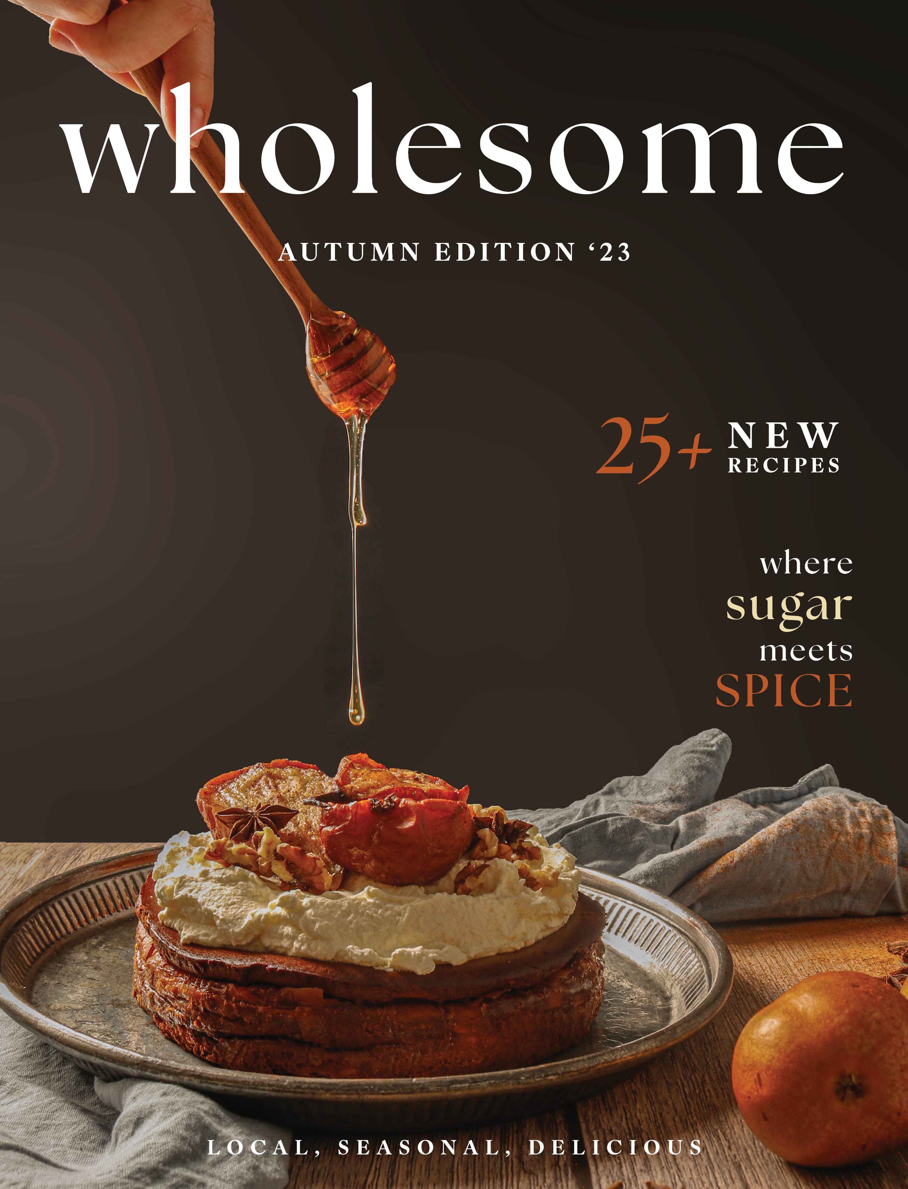

Food Magazine
Throughout this shoot, my goal was to evoke the comfort of an autumn, home-cooked dessert, something you could almost reach out and taste. I styled with edible elements and warm props, spices scattered at the edges, honey slowly dripping, to bring the cake to life and tell a story, not just show a cake on a stand. That sense of family and warmth guided the typography too, chosen to mirror the cozy, handcrafted feel of the imagery.

Photoshoot
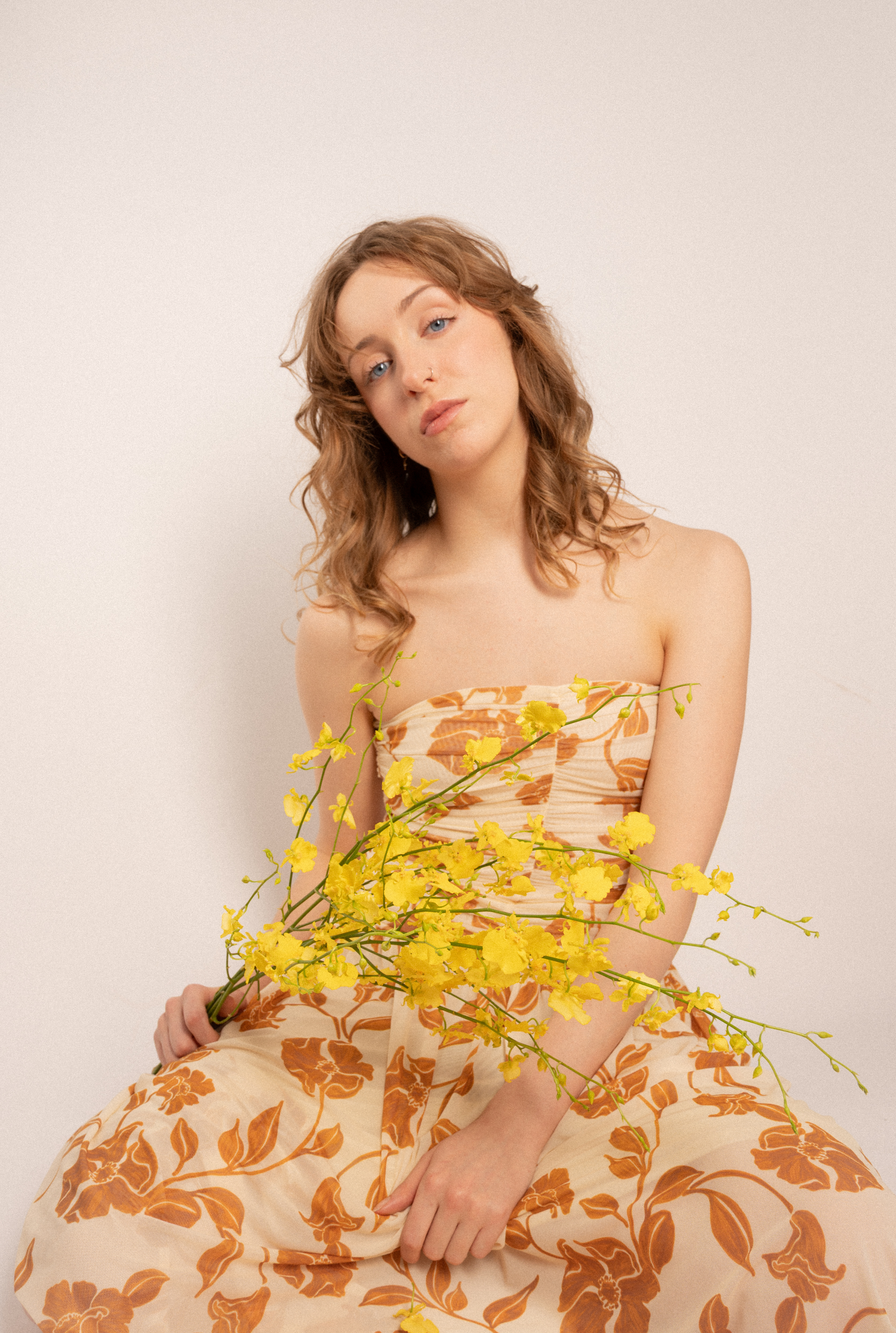
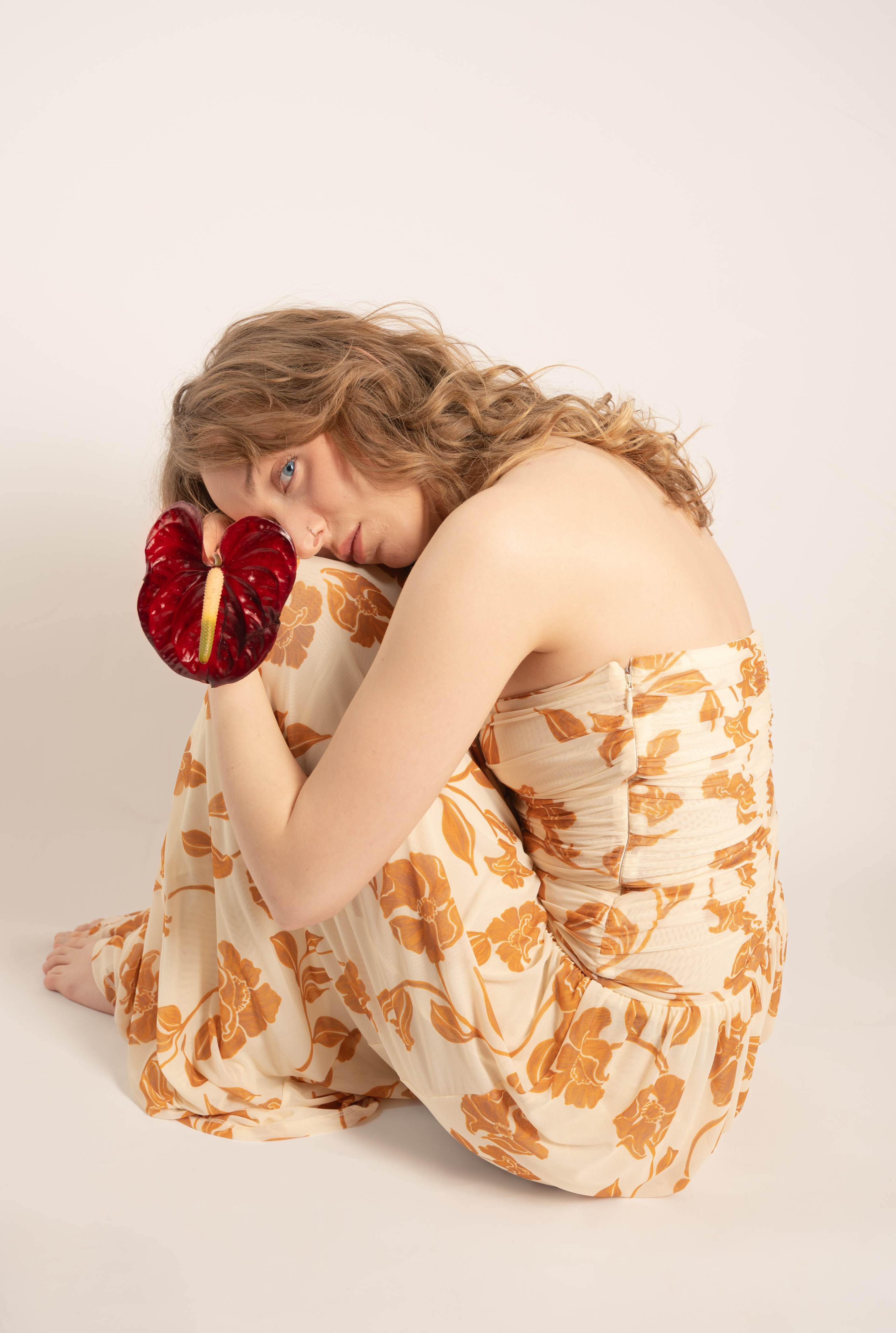
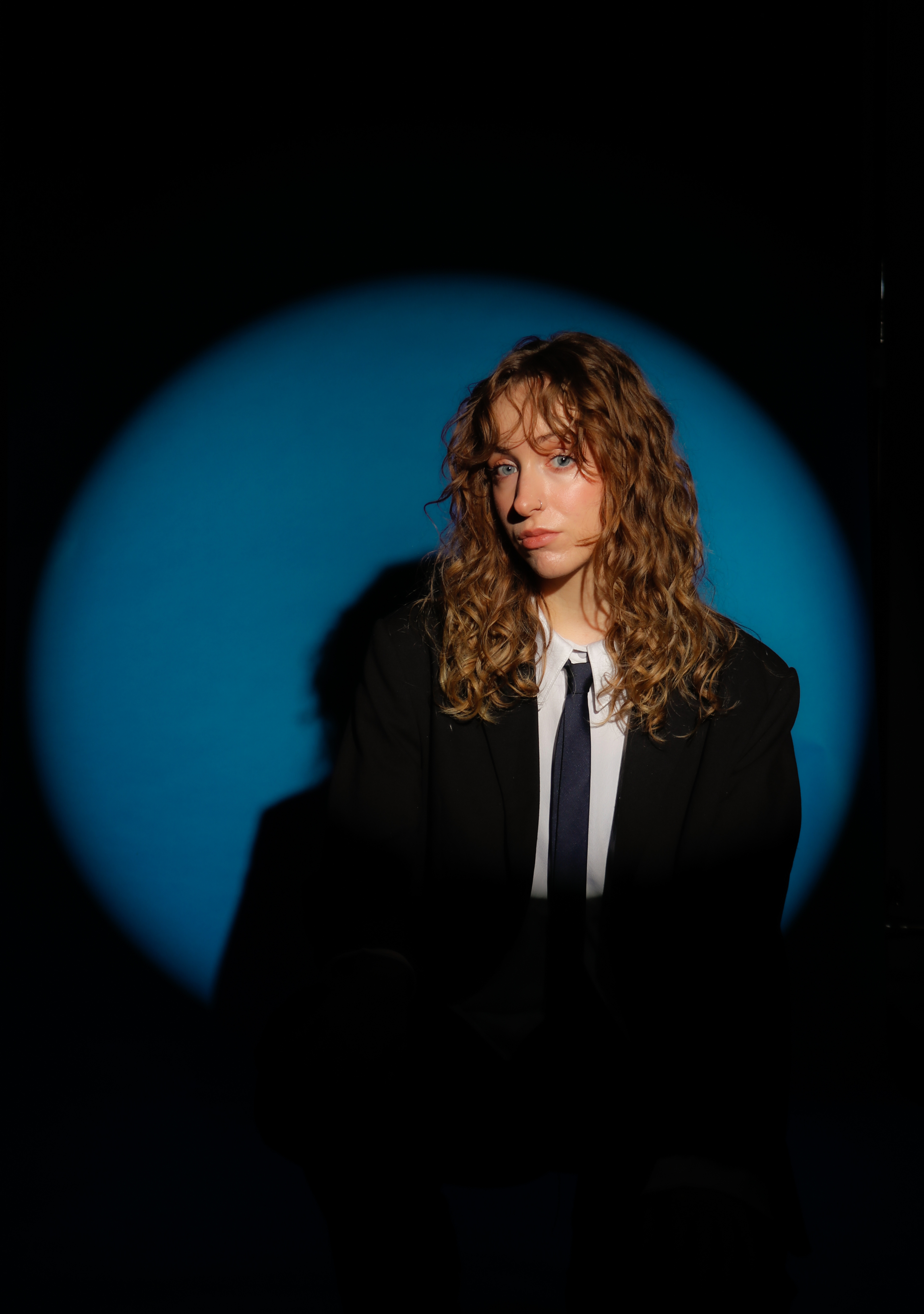
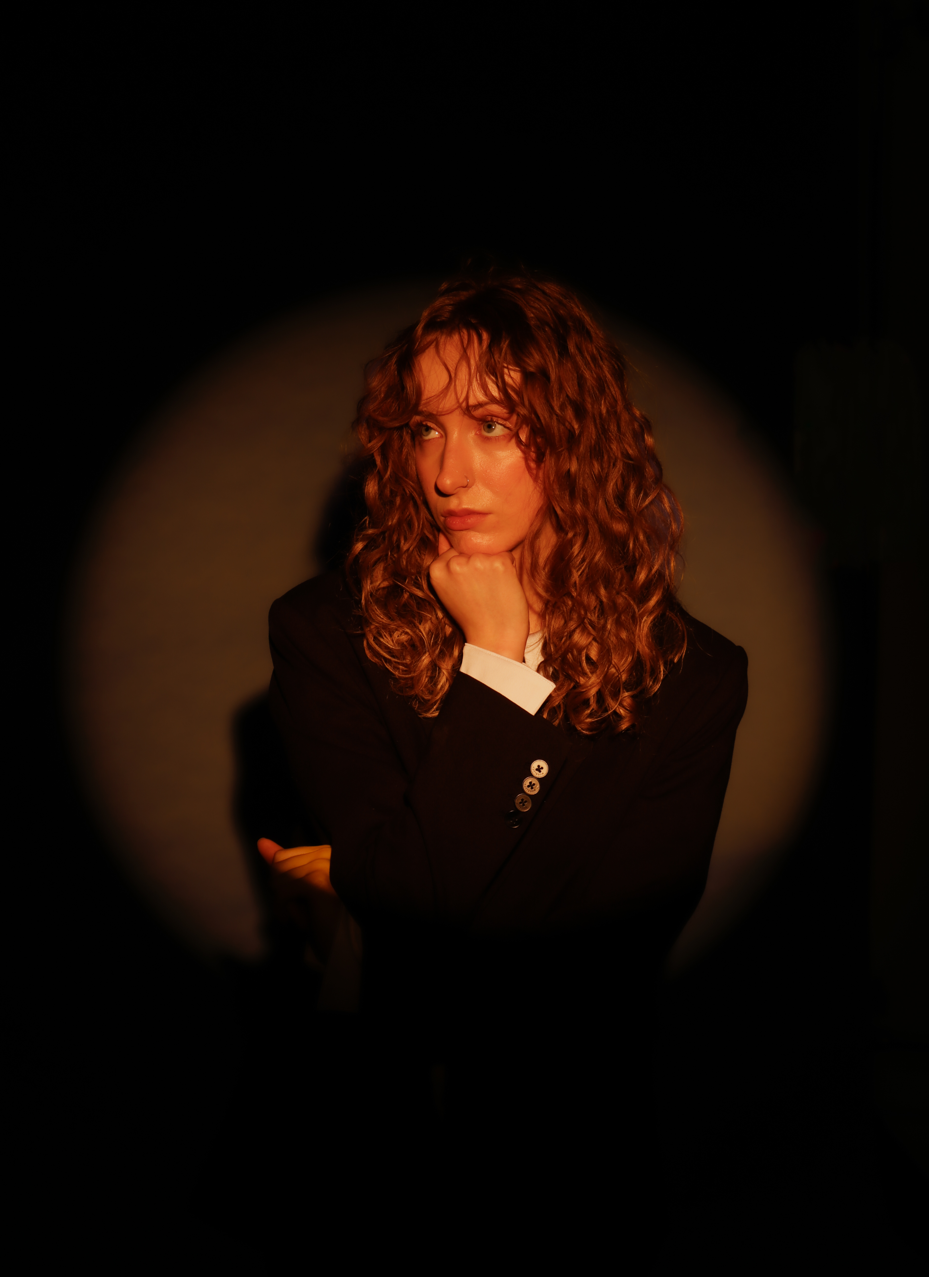
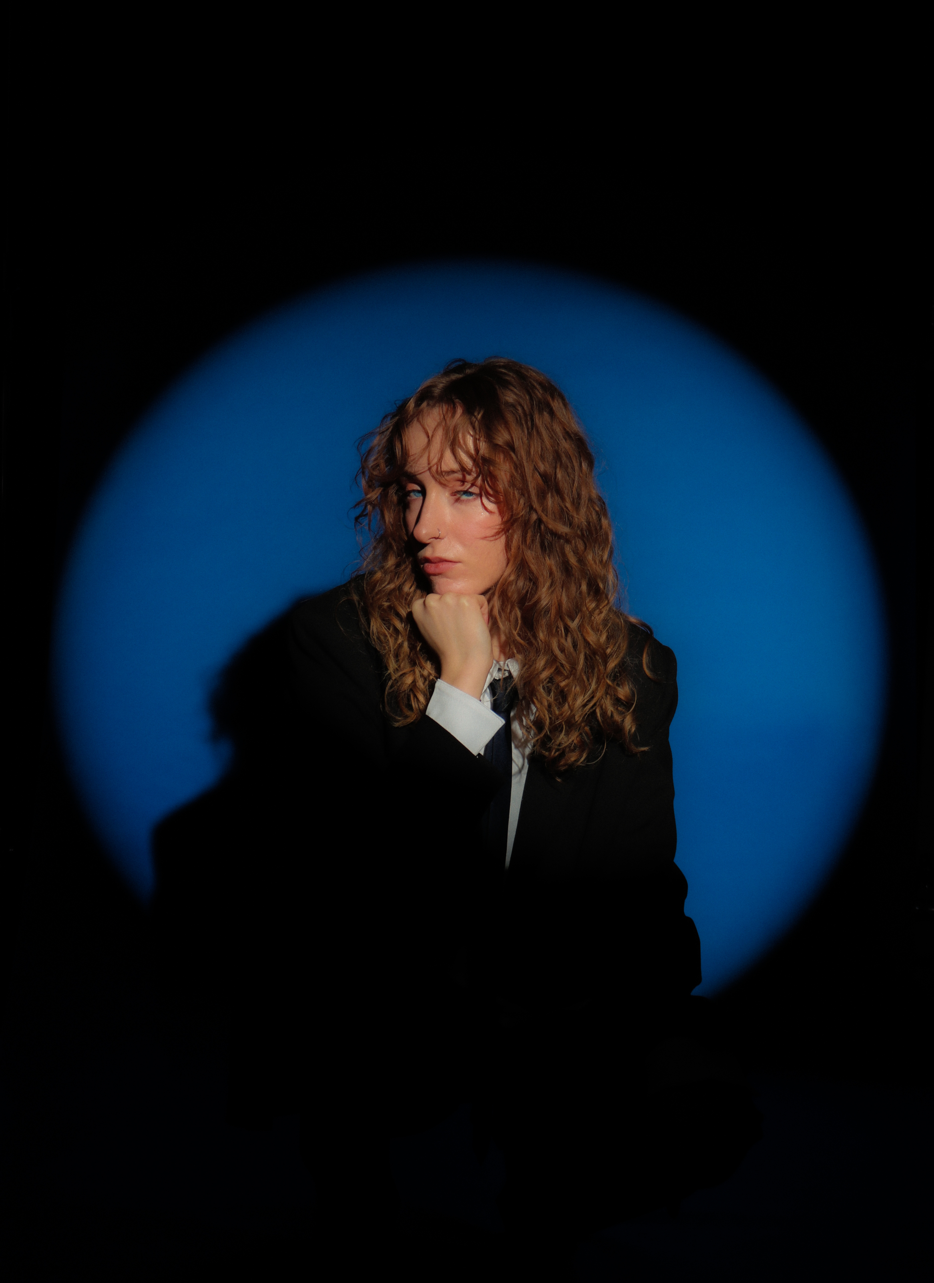
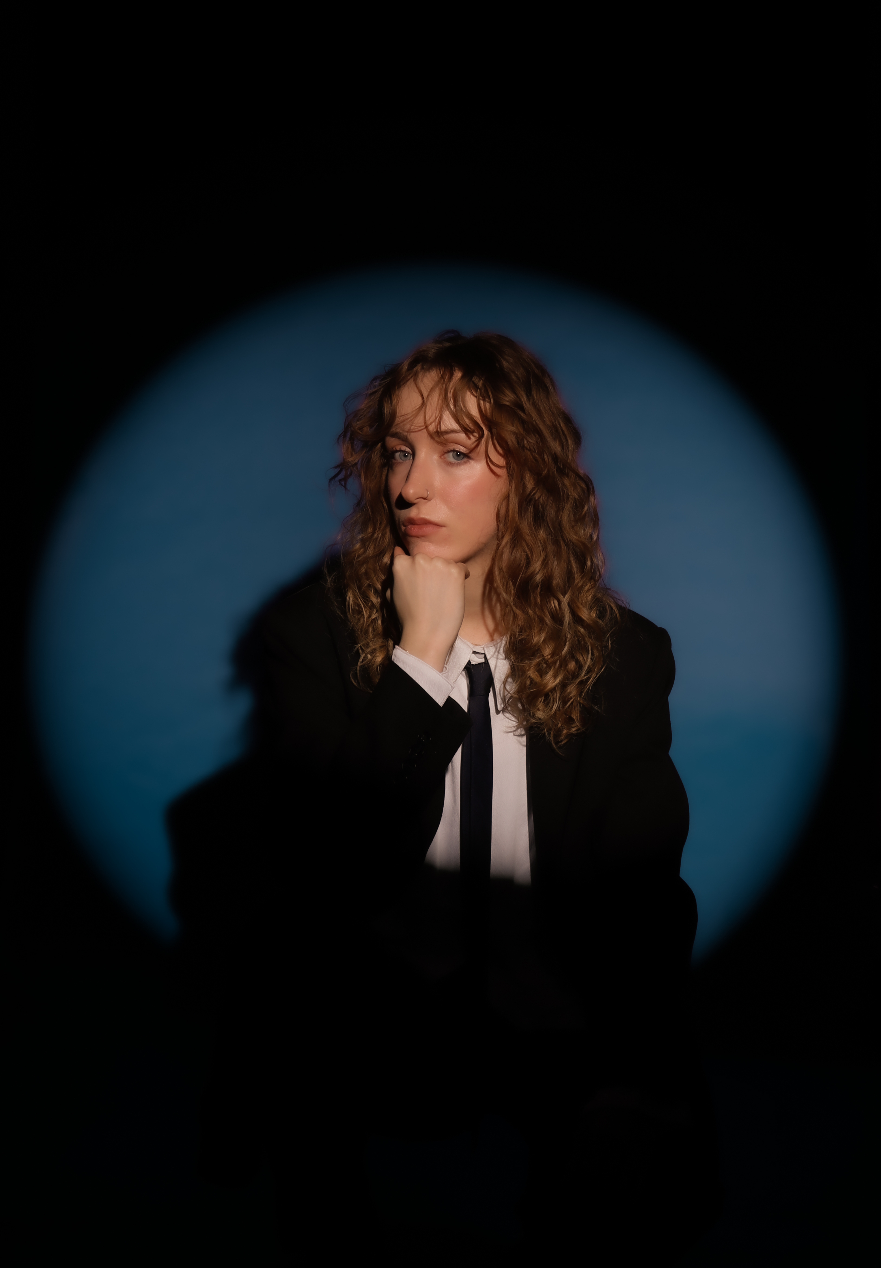
This was one of my favourite shoots. Collaborating with models to craft an evocative image let me explore fashion-editorial ideas while sharpening my Adobe Photoshop and Lightroom skills. I kept the retouching restrained, balancing colours so they harmonise rather than overwhelm, letting details like the dress hue and the model’s eye colour quietly elevate a simple composition.
That restraint carries into the lighting choices. By contrasting soft light with hard light, I shaped distinct moods: hard light for a bold, classic, traditionally masculine energy; soft light for a more divine, alluring, and confidently feminine presence. Props, like flowers, were used sparingly to emphasise the feminine notes. My aim was to show masculinity and femininity as equally powerful, expressed through different lenses of colour and light.
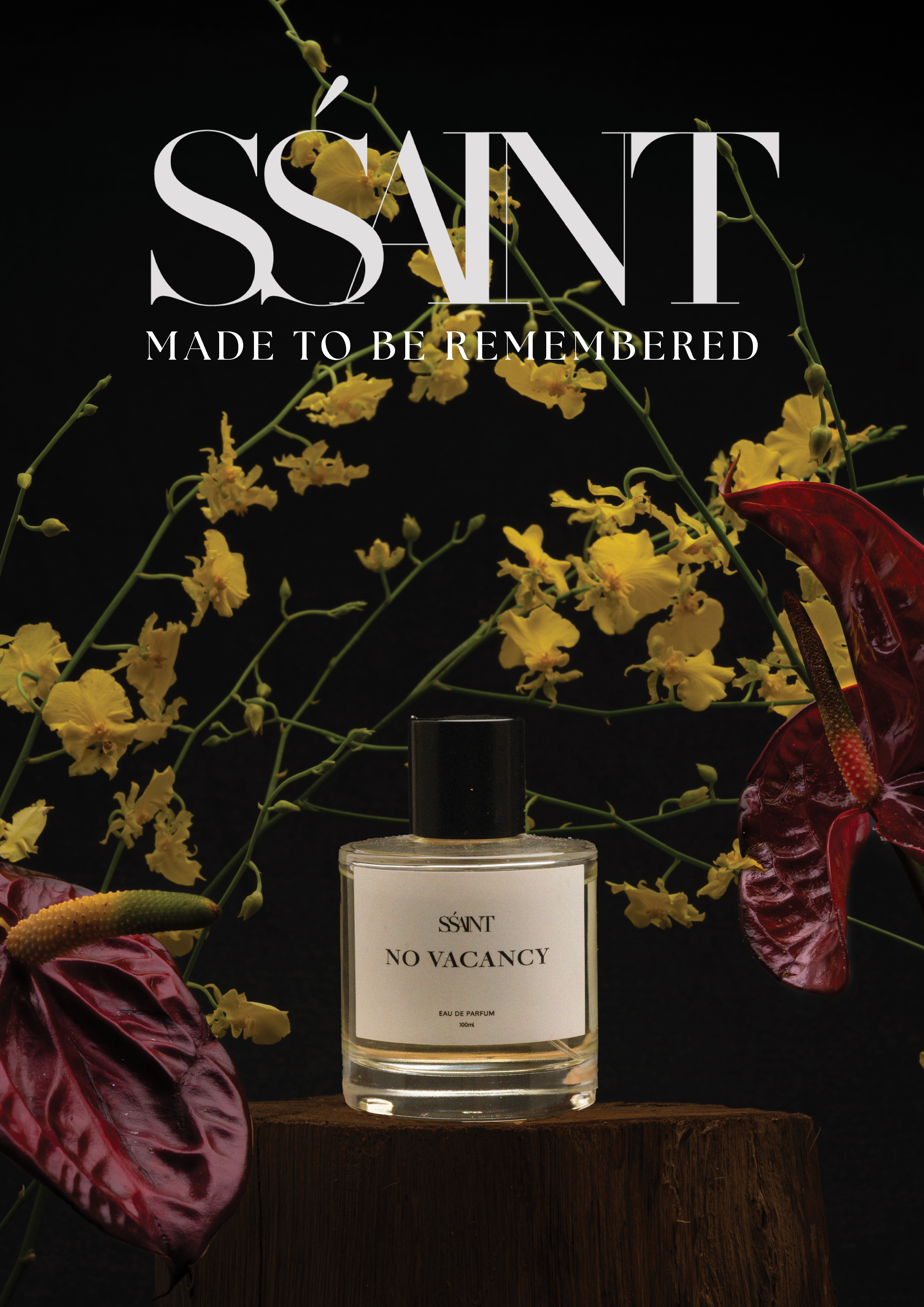
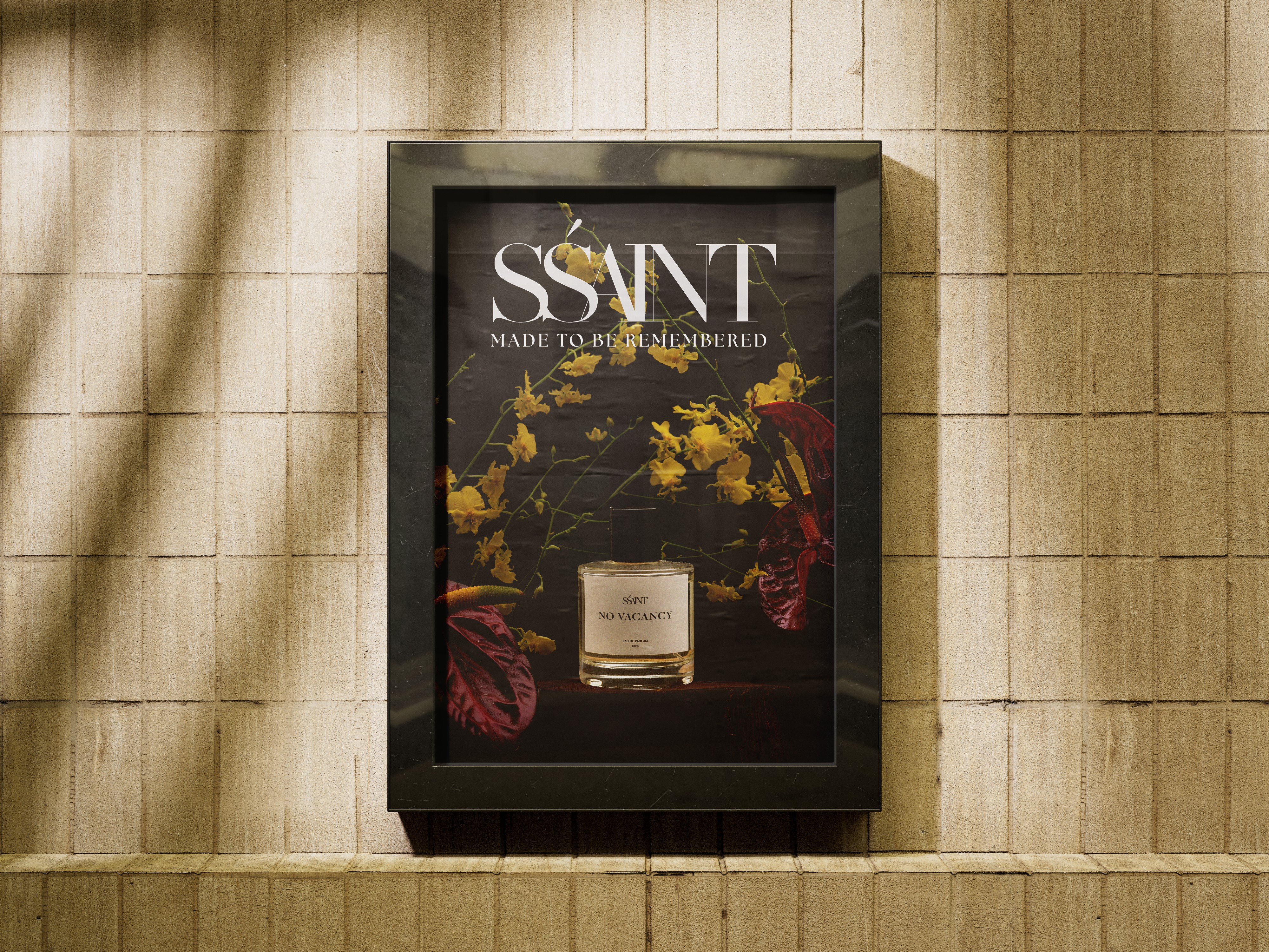
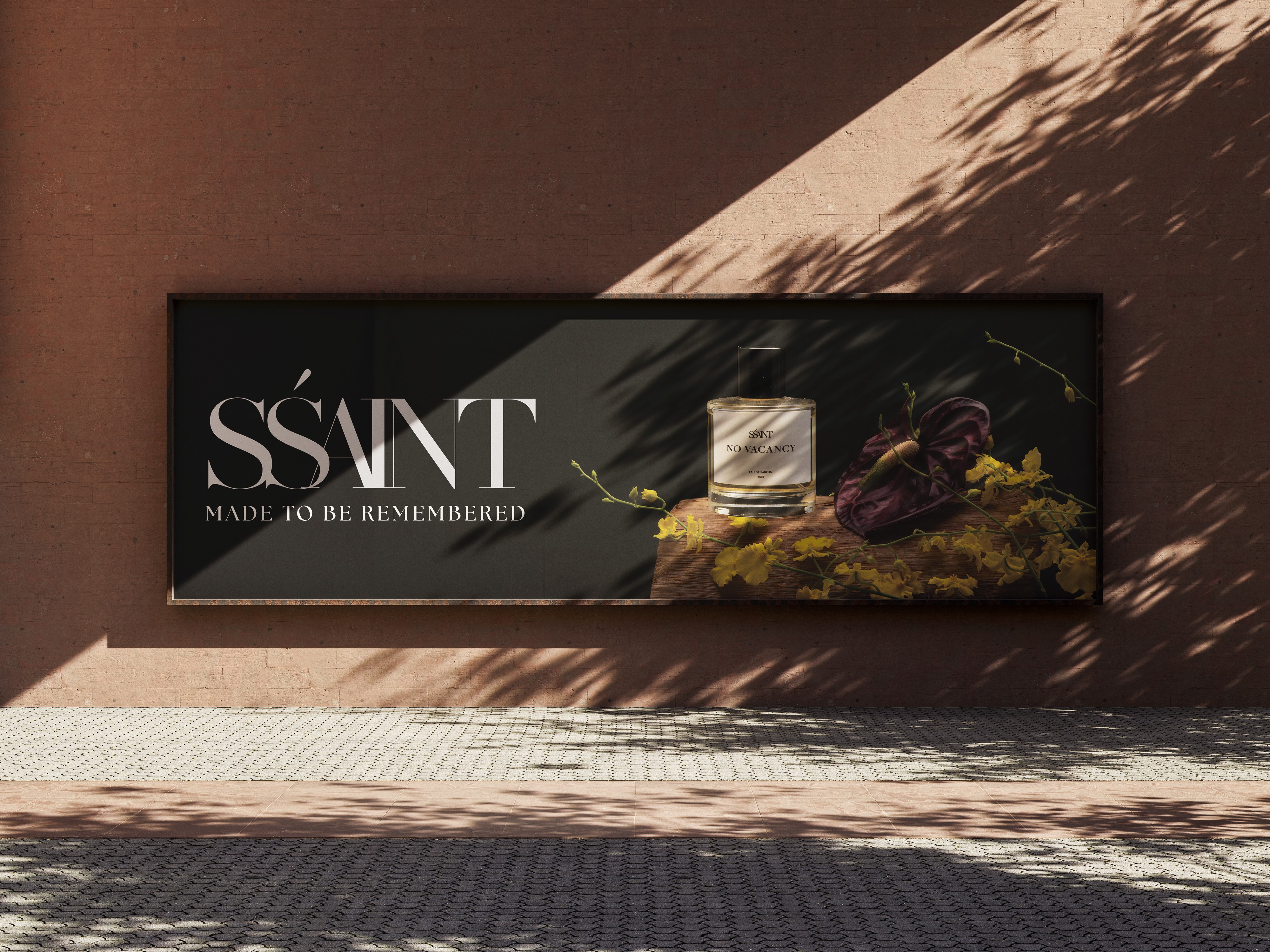
Perfume Advert
Elegance and luxury led every decision. This SSaint Perfumes ad needed to reflect a brand that’s high-end yet understated, so the composition is deliberately minimal with the fragrance as the focal point. Styling cues were chosen to suggest the scent profile, flowers for the floral notes, wood for the smoky depth, while the dark, bold backdrop amplifies the product’s luxurious character. Every prop is there to emphasise the perfume, not compete with it.
Considerations
01
I start with the audience. For the perfume ad, that means people who value quiet luxury, refined florals, balanced colour, and a clean composition that feels premium without being overdone. The product remains the hero, the logo is clear and recognisable, and the styling hints at the scent profile, a simple, elegant scene that makes you pause and want to try it.
02
Bringing the same values from my graphic design practice, clarity, craft, and restraint, into photography and art direction, creating work that’s just as visually engaging in a new medium. This project also expands my skill set, showing potential employers my range across photography, art direction, and the thinking that happens behind the camera.
Art Direction
Magazine Covers
Photoshoot
Throughout this shoot, my goal was to evoke the comfort of an autumn, home-cooked dessert, something you could almost reach out and taste. I styled with edible elements and warm props, spices scattered at the edges, honey slowly dripping, to bring the cake to life and tell a story, not just show a cake on a stand. That sense of family and warmth guided the typography too, chosen to mirror the cozy, handcrafted feel of the imagery.
Photoshoot
This was one of my favourite shoots. Collaborating with models to craft an evocative image let me explore fashion-editorial ideas while sharpening my Adobe Photoshop and Lightroom skills. I kept the retouching restrained, balancing colours so they harmonise rather than overwhelm, letting details like the dress hue and the model’s eye colour quietly elevate a simple composition.
That restraint carries into the lighting choices. By contrasting soft light with hard light, I shaped distinct moods: hard light for a bold, classic, traditionally masculine energy; soft light for a more divine, alluring, and confidently feminine presence. Props, like flowers, were used sparingly to emphasise the feminine notes. My aim was to show masculinity and femininity as equally powerful, expressed through different lenses of colour and light.
Perfume Advert
Elegance and luxury led every decision. This SSaint Perfumes ad needed to reflect a brand that’s high-end yet understated, so the composition is deliberately minimal with the fragrance as the focal point. Styling cues were chosen to suggest the scent profile, flowers for the floral notes, wood for the smoky depth, while the dark, bold backdrop amplifies the product’s luxurious character. Every prop is there to emphasise the perfume, not compete with it.
Considerations
01
I start with the audience. For the perfume ad, that means people who value quiet luxury, refined florals, balanced colour, and a clean composition that feels premium without being overdone. The product remains the hero, the logo is clear and recognisable, and the styling hints at the scent profile, a simple, elegant scene that makes you pause and want to try it.
02
Bringing the same values from my graphic design practice, clarity, craft, and restraint, into photography and art direction, creating work that’s just as visually engaging in a new medium. This project also expands my skill set, showing potential employers my range across photography, art direction, and the thinking that happens behind the camera.